
A couple weeks ago I received a review copy of Matthew Butterick‘s Typography For Lawyers (TFL), 2nd edition from the publisher. It’s not a new release, it actually came out last year. But it’s something that I’ve been meaning to read and the publisher sent me a copy, so here we are.
I’m not going to spend too much time on this review because it comes down to a pretty simple question:
Are you a word nerd?
- Do you know what kerning is?
- Do you care about what font you use?
- Do you worry about the specific layout of text on a page?
If you answered ‘no’ to the above, then you won’t be interested in this book.
But, if you’re a lawyer who regularly produces motions, briefs, or memos, then you should be interested in this book.
Show, Don’t Tell
A picture is worth a thousand words, so let’s just look at a couple of comparisons from TFL:
-

- Motion Before

-
- Motion After

-
- Memo Before

-
- Memo After
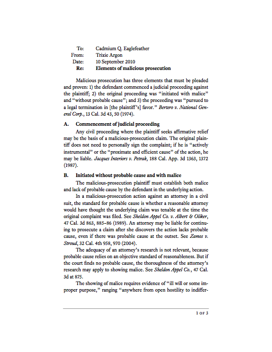
If that doesn’t make it apparent that you should care about typography, then I don’t know what to tell you. Actually, let’s look at another example from TFL that well illustrates one of the core problems with the writing lawyers produce.

Readers are lazy. Just because your reader is a judge (or a clerk) doesn’t change that. Actually, judges are probably even worse readers. They have an incredible volume of materials to read at any given point. They need to get in and get out when reading a brief or motion. They don’t have the luxury of time that you have as a writer.
That’s why typography matters.
TFL is a crash course in why you should abandon many old typography rules (they existed to accommodate typewriters). It will also teach you modern typography methodologies and tactics you can use to make your written materials look great (we have word processors and can make text look like anything).
TFL will teach you about:
- Type composition
- Text formatting
- Font recommendations
- Page layout
Each section is well thought out and easy-to-understand. TFL is a great example of “show, don’t tell.” You’ll understand the importance of typography just by reading it.
As Bryan Garner writes in the introduction, “If Matthew Butterick didn’t exist, it would be necessary to invent him.”
Highly recommended.
Click here to buy it now.